Advanced RIP and Halftone Control: Maximizing Print Quality and Dot Integrity in High-Volume Screen Printing

In high-volume screen printing, print quality depends on more than accurate color separation. The RIP settings that convert tonal information into printable halftone dots determine whether fine detail survives exposure, whether gradients remain smooth, and whether a production run stays consistent from the first shirt to the last.
Dot shape, frequency, screen angle, mesh count, ink deposit, squeegee pressure, and dot gain all interact. A setting that works for a 110 mesh screen and high-opacity plastisol may fail on a 230 mesh screen printing a simulated-process design. The goal is not simply to create smaller dots. It is to create dots that remain stable through film output, exposure, stencil production, and printing.
InkSplit brings automated color separation and a built-in RIP into one GPU-accelerated workflow. That unified approach helps high-volume shops reduce file transfers, preserve halftone settings, and move from artwork to production-ready channels in minutes instead of spending hours rebuilding files across separate applications.
Why RIP Control Matters in High-Volume Screen Printing
RIP software, or Raster Image Processing software, translates continuous-tone artwork into the raster data used to produce film positives. For screen printing, that often means converting gradients and photographic shading into amplitude-modulated halftones: organized dot patterns in which dot size changes to represent tonal values.
A disconnected workflow can introduce problems at every handoff:
A color separation application may use one tone curve while the RIP applies another.
Exported TIFF or PDF files may be flattened with incorrect transparency or channel information.
LPI and screen angle settings may be changed unintentionally during reprocessing.
Underbase and highlight channels may no longer align with the color layers.
Operators may output outdated files after making a last-minute artwork correction.
These errors are expensive in a production environment. They can lead to plugged screens, weak highlights, muddy midtones, registration issues, re-burns, and wasted film or emulsion.
A unified workflow keeps the separation data and RIP output connected. InkSplit’s automated color separation engine analyzes the artwork, generates individual ink channels, applies intelligent underbase logic, and provides a live print preview before output. Its built-in RIP helps maintain a consistent path from separated artwork to film production.
Advanced Halftone Settings for Screen Printing
Dot shape: round, elliptic, square, or diamond?
Dot shape affects how halftones connect through the tonal range and how well they tolerate screen printing variables.
Dot shape | Typical application | Advantages | Considerations |
Round | General apparel work and robust photographic halftones | Predictable, non-directional, and relatively resistant to moiré | Can create a noticeable midtone jump as adjacent dots meet |
Elliptic | Portraits, skin tones, and smooth gradients | Spreads dot joining across different tonal values for smoother transitions | More directional and potentially more sensitive to mesh interference |
Square | Graphic effects, retro artwork, and intentionally structured patterns | Crisp appearance and strong visual detail | Corners can connect abruptly; more vulnerable to moiré and dot gain |
Diamond | Specialized tonal work and controlled gradient transitions | Can reduce abrupt midtone transitions by changing the connection points | Requires careful angle, mesh, and exposure control |
There is no universal “best” dot shape. A round dot is often a dependable starting point for production because its geometry is non-directional. Elliptic or diamond dots may produce smoother gradients when midtone transitions are the primary concern. Square dots can be effective when the halftone pattern is part of the design aesthetic.
The correct choice depends on the ink system, substrate, screen tension, mesh thread diameter, exposure quality, and press conditions. For a high-volume shop, the most useful practice is to maintain validated RIP profiles rather than changing dot shapes job by job without testing.
LPI, mesh count, and printable dot size
LPI means lines per inch: the frequency of the halftone grid. Higher LPI produces smaller dots and can reproduce more refined detail, but it also reduces the process window. Fine dots are more vulnerable to underexposure, mesh interference, ink viscosity, and dot loss.
A commonly cited starting point is:
LPI = mesh count ÷ 4 to 5
This is only a starting point. For example, a 156–160 mesh screen may support conservative halftones around 32–40 LPI using that formula. A tightly controlled shop may validate 45–55 LPI on the same nominal mesh range, particularly with appropriate ink deposit and exposure control.
Typical starting ranges might include:
110 mesh: approximately 35–45 LPI for forgiving apparel halftones
156–160 mesh: approximately 40–55 LPI for standard cotton and detailed graphics
196–230 mesh: approximately 55–75 LPI for finer detail and controlled process work
280–305 mesh: higher-frequency work when tension, stencil, ink, and press conditions are highly stable
Mesh count alone does not determine halftone performance. Thread diameter, open area, mesh tension, emulsion thickness, and squeegee setup are equally important. A coarse mesh with heavy ink deposit may require a lower LPI, while a high-tension fine mesh can hold smaller dots with greater consistency.
A good RIP profile should connect LPI to a specific production setup: mesh, ink, garment or substrate, exposure unit, and press. Do not assume that a frequency that works on one automatic press will behave identically on another.
Screen Angles and Moiré Prevention
Moiré occurs when repeated patterns interfere with one another. In screen printing, interference can develop between the halftone grid and the mesh threads, between multiple color channels, or between the screen mesh and press-related artifacts such as slur or doubling.
For a single-color halftone, avoid placing the dot grid at 0°, 90°, or other angles that align directly with the mesh. A starting angle near 22.5° is commonly used because it bisects the mesh structure and helps the dots avoid landing directly on threads and knuckles.
For multi-color process or simulated-process work, separate channel angles rather than assigning the same angle to every plate. A common approach is to maintain approximately 30° of separation between major channels. Screen-printing angle sets may use combinations such as:
Yellow: 7.5°
Cyan: 22.5°
Black: 52.5°
Magenta: 82.5°
These values are not universal prescriptions. The correct angles depend on the mesh orientation and the specific RIP and imaging system. If moiré appears, make controlled adjustments:
Change the problematic channel by a few degrees.
Adjust LPI slightly: sometimes a 1–2 LPI change is enough.
Verify that the mesh is mounted consistently on the frame.
Check for press slur, excessive squeegee pressure, or registration movement.
Inspect the film positive and exposed stencil before changing multiple variables.
Changing every channel at once makes troubleshooting difficult. Adjust one variable, document the result, and keep the successful profile for future jobs.
Color Separation and Prepress Workflow for Halftone Integrity
Strong halftones begin before the RIP stage. The separation must preserve tonal information, define the underbase correctly, and keep each channel aligned.
A practical InkSplit workflow for a high-volume shop is:
1. Preflight and prepare the artwork
Confirm final dimensions, resolution, transparency, and printable detail. Use image scaling and trimming tools to establish the correct output size before building channels. Removing excess borders keeps the printable area focused and helps prevent unnecessary raster data.
2. Generate automated color separation
InkSplit analyzes the artwork and creates individual color channels, including spot colors, process colors, base white, and highlight white where appropriate. This is especially useful for complex artwork containing photographs, gradients, textured shading, or many overlapping colors.
3. Set production parameters
Choose the mesh range, LPI, dot shape, and screen angles based on the validated profile for the job. When a high-volume shop standardizes these parameters, operators can produce consistent work without rebuilding the RIP setup for every design.
4. Tune the underbase and ink coverage
Underbase strength, opacity, choke, and tonal behavior affect both color accuracy and print hand. InkSplit’s live base controls allow adjustments to be reflected in the print preview without restarting the entire separation. This helps operators evaluate whether a dark-garment underbase is too heavy, too weak, or likely to create unwanted buildup.
5. Inspect isolated channels
Review each channel at high resolution. Look for missing highlights, excessive solid areas, weak shadow detail, and unintended color contamination. Channel isolation is also where operators can identify whether a halftone is carrying the correct tonal information before burning screens.
6. Output through the built-in RIP
Keeping color separation and RIP processing in one environment reduces export steps and helps prevent mismatched curves or outdated files. InkSplit’s GPU-accelerated processing is designed to handle complex, multi-channel artwork quickly, helping shops reclaim approximately one to three hours of manual preparation per job depending on the design and existing workflow.

Dot Gain Compensation and Press-Side Validation
Dot gain is the increase in printed dot size compared with the dot represented in the digital file or film. It can result from ink pressure, stencil conditions, squeegee durometer, off-contact, fabric texture, mesh selection, and ink characteristics.
If dot gain is not controlled, highlights may disappear, midtones may become too dark, and shadow areas may plug into solids. Many shops use an initial compensation target near 30%, but the correct curve must be measured for the actual production environment.
To build a dependable curve:
Output a tonal ramp at the selected LPI and dot shape.
Print it using the intended mesh, ink, squeegee durometer, pressure, and substrate.
Compare the printed values with the expected values.
Adjust the RIP tone curve to compensate for the measured gain.
Repeat the test after major changes to ink, mesh, exposure, or press settings.
The goal is not to apply a generic correction. It is to create a repeatable tone reproduction curve for a known production setup.

Before-and-After Screenshot Instructions
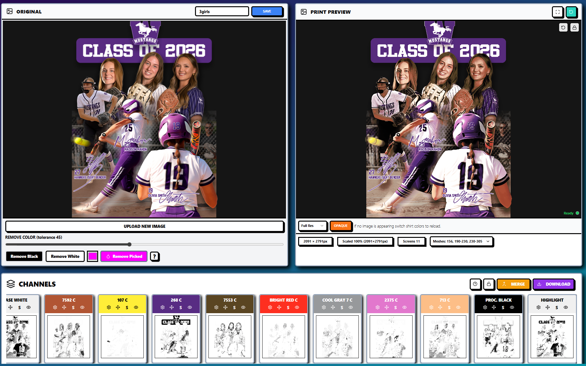
To document halftone generation and ink channel isolation clearly, capture the workflow using the same artwork and scale:
Before: Show the original full-color artwork in InkSplit’s Original panel.
After: Show the Live Print Preview with the selected garment or substrate color.
Halftone evidence: Zoom into a gradient, shadow, or photographic area after the RIP has generated halftones. The screenshot should show the tonal transition rather than only flat color regions.
Channel evidence: Include the Channels panel with base white, spot colors, process black, and highlight plates visible.
Production context: Keep the mesh selection, screen count, and preview controls visible when possible.
Comparison standard: Do not change artwork dimensions between the before and after captures. This makes the improvement in separation structure and print simulation easier to evaluate.
The screenshots above illustrate the ideal format: original artwork on one side, a simulated print result on the other, and isolated ink channels below.
A More Consistent RIP Strategy for High-Volume Shops
Advanced RIP control is ultimately a systems problem. Dot shape, LPI, screen angles, mesh count, dot gain, ink deposit, and exposure must work together. When each job passes through separate software applications, the risk of inconsistent interpretation increases.
InkSplit’s combination of automated color separation, live print preview, intelligent underbase controls, ink library matching, and built-in RIP gives shops a more connected prepress workflow. GPU-accelerated processing reduces the time required to process complex artwork, while channel-level visibility helps operators catch problems before film, screens, and garments are committed.
For additional product details, review the InkSplit features page and the guide on why a dedicated RIP pipeline still matters for automated separations. For foundational halftone terminology, this halftone overview from ScreenPrinting.com is a useful reference.
The best results come from testing and documentation. Establish a profile for each major mesh and ink combination, validate it with a tonal ramp, and use that profile consistently. With the right RIP settings and a unified color separation workflow, high-volume shops can protect dot integrity, reduce rework, and produce more precise prints at production speed.
Comments