top of page
All Posts

DTF Wash Testing: How to Prove Your Transfers Survive Before You Run the Full Order
A transfer that looks sharp right after pressing has not yet proven it can handle a customer’s laundry routine. A repeatable wash test helps you catch lifting edges, cracking, adhesive problems, and fading while you still have time to adjust the process. The key is to test the actual combination you plan to sell: garment, film, adhesive, artwork, press settings, and care instructions. A wash test is not a universal certification, but a documented shop-floor protocol can make

Ariel Chapa
2 hours ago5 min read

Cold Peel vs. Hot Peel DTF Transfers: How Film Choice, White Ink, and Color Separation Shape Print-Ready Results
Cold peel and hot peel describe when to remove the carrier film after pressing, not which transfer is automatically better. The right peel method depends on the film’s release coating and the instructions for the specific film, adhesive powder, ink, garment, and heat press combination. A clean release starts earlier than the press. Artwork edges, white-ink underbase, powder coverage, and curing all affect whether the image transfers evenly and holds up in wear. Peel technique
Ariel Chapa
1 day ago5 min read

How to Build DTF Gang Sheets That Don't Waste Film: Color Separation and Layout Strategy for Efficient DTF Print Preparation
A DTF gang sheet can look full and still waste film. Oversized transparent canvases, unplanned gaps, artwork that cannot be rotated, and incorrect white ink settings all consume material, or lead to a reprint. The solution is to treat gang-sheet building as two connected tasks: prepare each design for reliable output, then impose those designs efficiently on the film. This guide walks through both steps for print businesses that run DTF alongside screen printing. DTF gang sh
Ariel Chapa
2 days ago5 min read

Trapping and Choking in Screen Printing Color Separation: How Prepress Pros Kill Gaps, Halos, and Misregistration Before the Screen Is Burned
A hairline of white peeking around a red graphic can turn a strong print into a visible registration problem. Trapping and choking are prepress controls that help prevent those gaps and halos, but the goal isn’t to compensate for every press problem by piling on more overlap. It’s to use the smallest reliable adjustment for the job, then verify it against your press, ink, mesh, and garment. Screen printing prepress: What trap, choke, spread, and overlap mean In plain langua
Ariel Chapa
3 days ago8 min read

Screen Printing Proofs That Get Approved: Using Color Separation and Live Print Preview to Kill Revisions Before You Burn a Screen
Jobs rarely stall because a press can’t print the art. They stall earlier: the customer approves a white-background mockup, then sees the design on a dark garment, or on press, and asks for changes. By then, film may be output, screens burned, and the production slot booked. A better approval makes the production choices visible before they become production costs. That means showing the intended garment color, a real separation, its underbase and ink channels, and enough set
Ariel Chapa
4 days ago6 min read

Screen Printing Transfers vs. Direct Printing: Color Separation and Prepress Strategy for Plastisol and DTF Transfers
The choice between printing directly onto a garment and printing a transfer is not just a press decision. It changes how artwork is separated, how an underbase is built, and how dot gain and registration behave. The right process depends on the order, the garment, the desired hand feel, and whether the transfer needs to be stored for later. The screen printing decision: direct print or transfer? Direct screen printing deposits ink through a mesh screen onto a garment. A tra
Ariel Chapa
5 days ago6 min read
Screen Printing Test Prints: How to Build a Halftone and Color Separation Standard for Your Shop
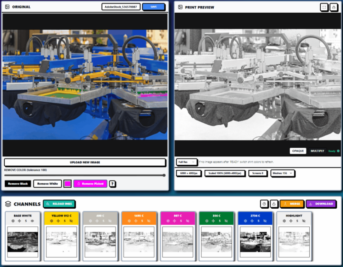
Before/after separation review in InkSplit, with channel previews and a 156-mesh selection visible. Use a physical test print, not the on-screen preview alone, to validate the LPI, dot shape, and press settings your shop adopts. A reliable screen printing test print turns halftone decisions from operator guesswork into a repeatable shop standard. With a consistent test form and documented press conditions, you can see which mesh counts hold your dots, where dot gain closes de
Ariel Chapa
5 days ago6 min read

Ganging and Nesting Screen Printing Jobs: Color Separation and Prepress Strategy for Mixed-Order Press Sheets
For a busy shop, a handful of short-run orders can mean more setup work than printing: separate films, screens, ink mixes, registrations and cleanups for each design. Ganging and nesting can reduce that overhead, but only when the artwork and production requirements are genuinely compatible. The key is to plan the gang in prepress, not just arrange designs to fill a sheet. Shared screens change color separation decisions, underbase construction, halftone settings and the risk
Ariel Chapa
7 days ago6 min read
Screen Printing Caps and Headwear: Color Separation and Prepress Strategy for Curved, Seamed Blanks
Printing a cap is not the same as printing a miniature T-shirt. The printable area is smaller, the surface is curved, and seams, stitching, buckram, eyelets, and the bill can all interrupt ink transfer. A separation that looks excellent on a flat monitor can produce broken halftones, uneven opacity, or a visible white halo once it reaches a structured crown. The solution is to treat headwear as a specialized screen printing prepress job from the beginning. The blank, cap plat
Ariel Chapa
Oct 97 min read

Screen Printing on Fleece and Hoodies: Color Separation and Halftone Strategy for High-Loft Blanks
Fleece and hoodies are not simply heavier T-shirts. Their raised fibers, brushed interiors, napped faces, seams, and compressible structure change nearly every screen-printing decision, from mesh count and halftone frequency to underbase coverage and off-contact. That matters as fall and winter production ramps up. Corporate fleece, team hoodies, crew programs, and seasonal retail artwork often combine dark garments with large, detailed graphics. A separation that works well
Ariel Chapa
Oct 87 min read
Screen Printing on Nylon Jackets: Color Separation and Prepress Strategy for Low-Cure Ink, Fine Detail, and Halftones
Before/after: InkSplit compares the original artwork with a simulated print preview while generating individual color channels. A separation that prints cleanly on cotton can fail quickly on a nylon jacket, windbreaker, athletic bag, or coated tote. The artwork may look correct on screen, yet the finished print can show poor adhesion, dye bleeding, cracked ink, plugged halftones, or a white halo around fine details. The problem is not always the press operator or the ink. Nyl
Ariel Chapa
Oct 78 min read

Screen Printing Team Uniforms: Color Separation and Prepress Strategy for Rosters, Numbers, and Multi-Color Artwork
A team order is rarely one design. For a screen printing shop, a school or league order may include 30–60 versions of the same uniform: one front logo, a back name, a back number, a sleeve number, and sometimes the same artwork printed on three different garment colors. If each variation is manually rebuilt, manually separated, and manually checked, the order can consume the margin before it reaches the press. The profitable approach is to separate the shared artwork once, st
Ariel Chapa
Oct 77 min read
Rush Orders Without Re-Burns: A Screen Printing Prepress Workflow for Same-Day Color Separation
A rush order that arrives at 9 a.m. and must ship at 5 p.m. does not leave room for trial-and-error prepress. The separation must be technically sound before transparencies reach the exposure unit, because one missed channel, weak underbase, or incorrect halftone setting can turn a same-day job into a re-burn, a press delay, or a missed shipping deadline. The solution is not simply “work faster.” It is to give rush artwork a defined path through intake, triage, color separati
Ariel Chapa
Oct 67 min read

Screen Printing Oversized and All-Over Prints: Color Separation, Halftone and Prepress Strategy for Large Placements
Oversized and all-over prints magnify every weakness in a screen printing workflow. A registration error that is barely visible on a 9-inch chest print can become obvious at the far edge of a 20-inch front panel. A gradient that looks smooth at standard size can show banding when expanded. A heavy underbase that feels acceptable in a small graphic can turn a large garment print into a stiff layer of ink. The solution is not simply using a larger screen. Large placements requi
Ariel Chapa
Oct 57 min read
Small Placements, Big Problems: Color Separation and Halftone Strategy for Left Chest, Sleeve, and Pocket Screen Printing
A small print is not simply a large print reduced in size. At 3.5 or 4 inches wide, a left-chest logo has far less room for error. Halftone dots become smaller, fine lines collapse, counters close up, and registration shifts that would be barely visible on a full-front print can create an obvious white halo around a small logo. The same is true for pocket prints, sleeve graphics, napkin prints, and garment tags. Because these placements are usually viewed at arm’s length, los
Ariel Chapa
Oct 57 min read

Reducing Screen Count in Screen Printing: How Spot Color Reduction and Index Separations Cut Setup Time Without Killing Color
Every additional screen affects more than the press schedule. It adds film output, coating, exposure, registration, setup, cleanup, and another variable that can create color drift or misregistration. That does not mean every job should be forced into the fewest possible colors. The goal is to reduce unnecessary screens while preserving the visual information that makes the artwork work: brand colors, contrast, gradients, facial detail, highlights, and depth. A controlled scr
Ariel Chapa
Oct 27 min read

Screen Printing on Heather and Triblend Blanks: Color Separation and Halftone Strategy for Soft-Hand Prints
Heather and triblend garments are popular because they feel comfortable, drape well, and create a premium, broken-in look. They are also less forgiving than a smooth 100% cotton shirt. The fabric itself fights the print. Visible fiber texture interrupts ink coverage. Polyester and rayon fibers absorb and reflect color differently from cotton. Dark synthetic dyes can migrate through the print film. Fine halftone dots may disappear into the fabric surface, while an overly heavy
Ariel Chapa
Oct 27 min read
Raster vs. Vector Artwork in Screen Printing: How File Type Changes Your Color Separation and Halftone Results
A customer’s artwork can look perfect on a monitor and still create problems at prepress. The file type, vector or raster, determines how cleanly edges reproduce, how colors can be separated, and whether fine details survive halftoning and screen exposure. For screen printing shops, the goal is not simply to accept the highest-resolution file. It is to understand what the artwork can actually support at the intended print size, then choose a separation and output workflow tha
Ariel Chapa
Sep 307 min read

GPU-Accelerated Color Separation in Screen Printing: Why Prepress Speed Is Really a Press Throughput Problem
A screen printing press can only print what prepress has released. That sounds obvious, but many shops still measure press capacity by carousel speed, flash-cure time, or operator efficiency while treating color separation as an administrative step. In practice, the separation queue often determines how many jobs reach the press during a shift. If one complex design takes 30–90 minutes to separate, a shop running six to eight jobs per day can spend three to twelve hours waiti
Ariel Chapa
Sep 307 min read

Screen Printing Distressed and Vintage Artwork: How Color Separation Keeps Grain, Grunge, and Halftone Texture Clean
Distressed artwork looks simple until it reaches prepress. A clean vector graphic can often be separated by identifying its edges, assigning colors, and building a small set of solid channels. Vintage artwork does not behave that way. Grain, cracked ink, faded areas, grunge overlays, and simulated age are built from thousands of small luminance changes. Those changes may not define an object’s edge, but they determine whether the finished print feels textured, worn, and inten
Ariel Chapa
Sep 298 min read
bottom of page