Small Placements, Big Problems: Color Separation and Halftone Strategy for Left Chest, Sleeve, and Pocket Screen Printing

A small print is not simply a large print reduced in size.
At 3.5 or 4 inches wide, a left-chest logo has far less room for error. Halftone dots become smaller, fine lines collapse, counters close up, and registration shifts that would be barely visible on a full-front print can create an obvious white halo around a small logo.
The same is true for pocket prints, sleeve graphics, napkin prints, and garment tags. Because these placements are usually viewed at arm’s length, lost detail and muddy color transitions are immediately noticeable.
A reliable small-placement workflow starts with the final print size, not with a large separation that is scaled down later.
Why Small Screen Printing Placements Fail Differently
Large graphics can often absorb minor separation problems. A broad shadow may still read correctly if a few details disappear. Small artwork has no such margin.
Common failure points include:
Hairline strokes disappearing during exposure or printing
Reverse lettering filling in
Halftone dots washing out or plugging
Underbase edges becoming visible as halos
Registration errors distorting small type and borders
Excess ink deposit making the print feel heavy
Too many screens slowing setup more than the design justifies
Artwork being scaled without recalculating the halftones
For a typical adult left-chest print, shops often work in the 3.5–4-inch range. Pocket prints are commonly held near 3 × 3 inches, while sleeve graphics may be approximately 2.5–3.5 inches wide depending on the garment and sleeve construction.
The smaller the placement, the more important it is to establish production limits before separation.
Small-Placement Color Separation: Start With the Final Size
The artwork should be prepared and evaluated at its actual print dimensions. If the final left-chest width is 3.75 inches, inspect the design at 3.75 inches, not only at the large working size on a monitor.
At final size, check:
Smallest positive line
Smallest reverse line
Letter counters and enclosed spaces
Borders and traps
Highlight detail
Isolated halftone dots
Fine texture
Artwork clearance from seams
Do not simply scale finished films or an existing large separation. Scaling changes the relationship between the halftone cell, dot size, line width, and screen mesh. A separation that works at 12 inches may produce unusable dots at 3.75 inches.
Instead, scale the source artwork to the final production size and re-separate it. This allows the color separation process to recalculate the halftones, underbase, and channel coverage for the smaller image.
InkSplit’s image size controls help prepare artwork at its intended production dimensions while preserving resolution and halftone integrity. Its GPU-accelerated processing also makes it practical to re-separate a small placement after a client changes a logo, color, or garment.
Halftones and Mesh Count for Small Screen Printing
A common starting point for detailed small placements is a 305–355 mesh screen with halftones in the 55–65 LPI range. This is not a universal prescription; thread diameter, screen tension, emulsion, exposure, ink viscosity, garment texture, and press setup all affect the result.
The reason this combination can work well is resolution. A 305–355 mesh screen provides enough thread density to hold finer halftone structure without depositing as much ink as a coarse mesh.
At 55 LPI, one halftone cell is approximately 0.46 mm wide. At 65 LPI, it is approximately 0.39 mm wide. A theoretical 5% round dot is therefore only about 0.09–0.10 mm in diameter before real-world variables such as exposure, dot gain, mesh interference, and fabric absorption are considered.
That mathematical minimum is not a production guarantee. For a dependable recipe:
Screen mesh | Halftone LPI | Practical starting point |
230–280 mesh | 45–55 LPI | More forgiving, moderate detail |
305 mesh | 55–60 LPI | Strong option for detailed small placements |
355 mesh | 60–65 LPI | Fine detail when tension and exposure are controlled |
For small left-chest, pocket, and sleeve prints, treat 5% highlights as a floor to validate, not an automatic promise. If the smallest dots carry important information, test them on the actual garment and ink system.
A practical starting target is:
Positive lines: approximately 0.20–0.25 mm minimum
Reverse lines: approximately 0.30–0.40 mm minimum
Highlight halftones: generally 5–8% or larger after RIP output
Critical counters: larger than the minimum line threshold whenever possible
Water-based ink may require additional testing because ink can dry in the stencil and may behave differently on highly absorbent fabric. A high mesh count and fine LPI can improve detail, but only if the screen remains open and the ink maintains consistent flow.
Choosing a Realistic Screen Count
Small artwork does not automatically justify a large number of screens.
For many left-chest or pocket designs, two to four image colors plus an underbase is a practical production range. Five or six screens may be appropriate when the artwork contains important gradients, skin tones, brand colors, or controlled highlight information.
Beyond that, the setup burden can outweigh the visual benefit. Every additional screen adds:
Another screen to coat, expose, wash out, and register
More ink mixing and color matching
More opportunities for registration drift
Additional print stations or longer press setup
More washout and reclaim work
A premium small print may require six or seven screens, but the extra channels should solve a visible problem. If a color contributes only a tiny area that disappears at final size, merge it into another channel or rebuild the separation around the most important visual information.
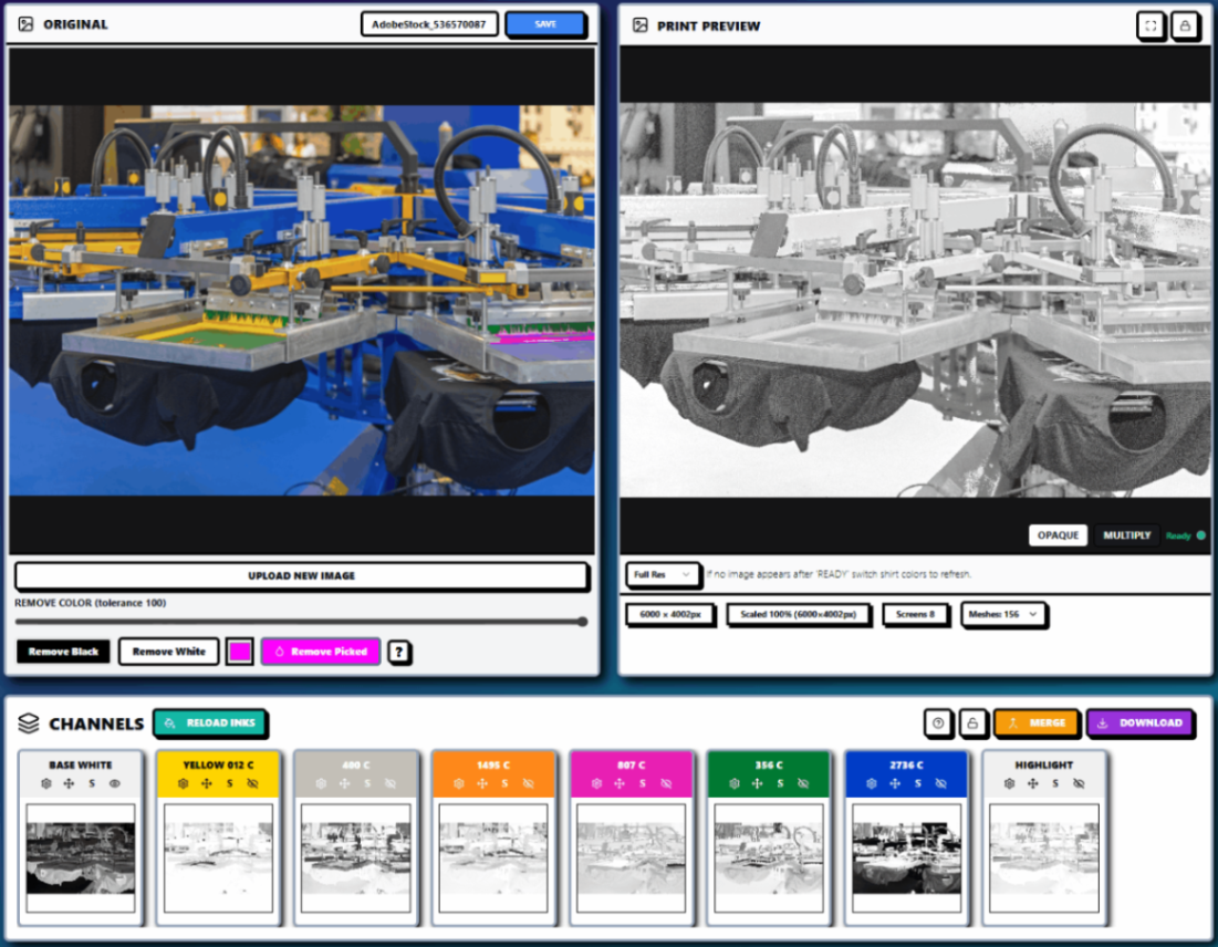
InkSplit can generate and display the channels together so the operator can assess whether each screen contributes enough to justify its place in the job.
Underbase Choke, Spread, and Small-Print Halos
Underbase problems are amplified on small graphics.
A slight registration shift between the white underbase and the top colors can create a visible white edge around lettering, outlines, and isolated details. On a large print, that edge may blend into the composition. On a 3.5-inch logo, it can make the entire print look misaligned.
An inward underbase choke is a common starting point. Depending on the shop’s registration tolerance and output resolution, approximately 0.1–0.25 mm may be appropriate. The correct amount depends on the normal registration error of the press and the artwork’s smallest features.
Too little choke can expose a white halo. Too much choke can:
Remove the underbase from narrow color areas
Make small type look thinner
Close counters
Reduce opacity in important highlights
Create inconsistent color coverage
A toned or softer underbase may improve hand-feel and reduce unnecessary ink buildup, particularly when the artwork contains transparent shadows or halftones. The goal is not to place solid white under every pixel. The goal is to provide enough support for the intended colors on the selected garment.
InkSplit’s base controls allow operators to adjust softness, contrast, opacity, and choke while reviewing the effect in the live preview.

Prepress and Screen Printing Setup Variables
Fine artwork cannot compensate for an inconsistent press setup.
For small placements, standardize the physical variables that influence dot integrity and registration:
Use consistent screen tension across color stations.
Start with a 75 durometer squeegee for controlled ink deposit; adjust for the ink and garment.
Use a light flood that fills the stencil without overloading fine halftones.
Set off-contact based on the substrate, often approximately 1.5–2.5 mm for lightweight garments and somewhat more for fleece.
Avoid excessive squeegee pressure, which can distort fine detail and force too much ink through the stencil.
Keep the print area flat and away from seams whenever possible.
Confirm platen alignment for left-chest, pocket, and sleeve positions before production.
Registration tolerances that seem small numerically become significant at this scale. A 0.25 mm shift can alter a narrow border, expose an underbase, or make two adjacent colors appear uneven.
For actual sewn pockets and sleeves, fixtures or specialty platens may be necessary to prevent seams, pocket edges, and curved fabric from interfering with the print surface.
Standardize Small-Placement Recipes
A shop should not rely on one operator’s memory to decide how every small logo is separated.
Create standard recipes for common placements, such as:
Left-chest recipe
3.5–4 inches wide
305 mesh for detailed halftones
55–60 LPI starting range
0.20–0.25 mm positive line minimum
Controlled underbase choke
Two to four image colors plus underbase when possible
Pocket recipe
Approximately 3 × 3 inches maximum
Simplified detail and larger counters
230–305 mesh depending on artwork
Conservative halftone range
Clearance from pocket seams
Specialty pocket platen when printing directly on the pocket
Sleeve recipe
Approximately 2.5–3.5 inches wide
Avoid shoulder and sleeve seams
Confirm artwork orientation before separation
Use a hard, controlled squeegee stroke
Validate placement on the actual garment size
Napkin or tag recipe
Use the actual stock or substrate for testing
Consider one or two spot colors where detail is limited
Avoid assuming garment settings will transfer to paper or textile napkins
Use a separate recipe for absorbency, dot gain, and ink deposit
Record the mesh count, halftone LPI, screen angle, durometer, ink system, underbase behavior, garment color, and approved preview with the project.
A Repeatable InkSplit Workflow for Small Artwork
A practical workflow looks like this:
Upload the source artwork.
Set the final print dimensions and garment color.
Clean unwanted background colors and excess borders.
Generate the separation at final size.
Review channel count and merge unnecessary colors.
Match channels to the shop’s ink library.
Adjust the underbase choke, softness, and opacity.
Inspect halftones and fine lines at 100% output size.
Review the live print preview on the actual garment color.
Save the approved project and production settings for reorders.
InkSplit’s precision color matching helps connect the separation to the shop’s established ink library instead of relying only on an on-screen approximation. Its cloud project storage keeps the artwork, channels, garment assumptions, and approved settings together, making repeat left-chest jobs easier to reproduce.

InkSplit is separation software with a built-in RIP available for shops that do not already use a preferred RIP method. The core workflow remains the same: prepare the artwork correctly, generate production channels, validate the result, and preserve the project for the next run.
Save Time Without Sacrificing Small-Print Quality
Small placements often appear simple to customers, but they can consume disproportionate prepress time when the separation must be rebuilt after a minor revision.
Automated separation, live underbase controls, ink-library matching, and GPU-accelerated reprocessing help reduce that friction. Depending on artwork complexity and the existing workflow, InkSplit can save approximately 1–3 hours per job and about $45 in production labor.
The larger benefit is consistency. When a customer reorders the same left-chest logo, the shop can reopen the approved project instead of guessing at the original halftone settings, choke value, mesh selection, or garment color.
For more guidance, review InkSplit’s separation features, repeatable ink library workflow, and cloud archive workflow for reorders.
Small artwork rewards discipline. When the file is separated at final size, the halftones match the mesh, the underbase is controlled, and the press recipe is standardized, a 3.5-inch logo can print with the same confidence as a much larger graphic.
Comments