Screen Printing Color Management: Build a Repeatable Ink Library Workflow

Color consistency in screen printing is not created by choosing a familiar Pantone value and hoping it reproduces correctly on press. It comes from controlling the complete path from artwork to ink: the source file, color separation, underbase, mesh count, halftone settings, press conditions, garment, and approved production sample.
That becomes even more important when a customer reorders the same design months later. If the original separation is difficult to locate, the ink formulas are undocumented, or the artwork was rebuilt by a different operator, “same as last time” can quickly become a new color-matching project.
A repeatable workflow connects your digital ink library to your prepress decisions and stores the project details needed for future production. InkSplit helps automate that workflow with GPU-accelerated color separation, synchronized ink-library color matching, intelligent underbase generation, palette optimization, and live print preview.
Why screen printing color management starts with production standards
A monitor displays color using emitted RGB light. A screen print reflects light from deposited ink on a specific substrate. Those two color systems will never behave identically, especially when printing saturated colors, dark garments, or complex simulated process artwork.
The objective is not to make the monitor look exactly like the shirt. The objective is to create a controlled, documented translation from the customer’s artwork to a printable ink system.
Start by defining the variables your shop can control:
Ink system: Brand, series, formula, viscosity, opacity, and mixing method.
Substrate: Garment color, fabric type, fiber content, and surface characteristics.
Mesh count: Lower mesh counts generally deposit more ink, while higher counts support finer detail and more controlled halftones.
Squeegee: Durometer, angle, pressure, and print speed affect ink deposit and color strength.
Flash and cure: Temperature and dwell time can influence opacity, hand feel, and intercoat adhesion.
Underbase: Solid, tonal, or soft underbase strategies change the appearance of every top color.
Halftone settings: LPI, dot shape, angle, and curve compensation influence gradients and simulated process color.
These variables should be treated as part of the color recipe: not as pressroom details that can be left out of the job record.
Industry color-management guidance often frames this process around consistency, calibration, characterization, conversion, control, and conformance. For screen printers, the practical version is simple: stabilize the production method, compare results against physical references, and record what worked.
Build a screen printing ink library that reflects your press
A generic digital swatch library is useful for design, but it is not a complete production reference. The same named color can look different depending on mesh, ink deposit, garment color, underbase coverage, and curing conditions.
Your shop’s ink library should include both digital and physical information:
InkSplit’s ink-library workflow helps connect these decisions to the separation. Instead of manually rebuilding a palette for each job, operators can work from synchronized color choices and review how those colors interact in the live preview.

An organized ink library makes the selected production palette visible before screens are prepared.
Create a repeatable color separation workflow
Different artwork types require different separation strategies. A clean spot-color logo should not be processed the same way as a photographic simulated process design.
Spot-color separation
For spot-color artwork, each intended ink should remain a true spot color rather than an accidental CMYK build. The job record should identify:
Spot color name or Pantone reference
Screen assigned to the color
Mesh count and halftone requirements
Whether the color prints over an underbase
Any choke, trap, or spread applied during prepress
This approach makes the result easier to reproduce and gives the press operator a clear map of the job.
Simulated process separation
Simulated process printing uses multiple spot and halftone channels to reproduce a broad range of colors on garments. The channel set may include process-like colors, bump colors, neutral tones, a base white, and highlight white.
The key is consistency. If every operator chooses a different palette or handles shadows differently, reorders will not match even if the artwork file is unchanged.
InkSplit automatically analyzes complex artwork and helps build an optimized channel set. You can review the proposed palette, adjust individual channels, and compare the result in a live print preview before committing to film output.
Underbase and hand feel
A heavy, unnecessarily solid underbase can make a print feel thick and plastic. An underbase that is too weak can produce dull colors, poor coverage, or visible garment contamination.
Intelligent underbase generation helps place white ink where it contributes to opacity and color stability, rather than treating every pixel identically. This supports more predictable color while helping preserve a softer hand.

Underbase softness, contrast, and choke can be evaluated before production so coverage and hand feel are part of the color decision.
Standardize prepress settings for mesh count and output
A color library cannot compensate for uncontrolled plate production. Your separation workflow should include a standard prepress profile for common job types.
For example, a shop might define:
Underbase: 156 mesh with a controlled tonal or solid base
Spot colors: 190–230 mesh depending on opacity and detail
Fine detail and process colors: 230–305 mesh
Halftone frequency: A documented LPI matched to the selected mesh
Dot shape: Consistent round or elliptical dots
Screen angles: A standard angle set that reduces moiré
Output resolution: Consistent film or direct-to-screen resolution
Curve compensation: Adjustments based on measured dot gain
A common starting guideline is to use a mesh-to-LPI ratio of approximately four to five times the halftone line screen. It is not a universal rule, but it provides a useful baseline for evaluating whether a selected mesh can reliably hold the chosen dots.
For shops that need halftone film output, InkSplit also includes built-in RIP functionality. That gives operators a direct path to output while keeping separation and halftone decisions connected. Shops with an established RIP software workflow can continue using their preferred output process.
Before/After: screen printing color separation in InkSplit
The most useful color-management checkpoint is the comparison between the original artwork and the separated print preview. Look for channel count, underbase behavior, tonal transitions, highlight retention, and the relationship between the selected palette and the garment color.

Before/After: The original artwork appears in the left panel, while InkSplit’s separated print preview and individual channels appear on the right and below. The workflow includes a base white, spot colors, process black, and highlight channel.
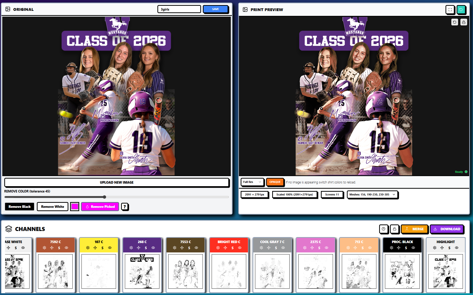
Before/After: A complex apparel design is reviewed with an eleven-screen separation, multiple spot colors, process black, highlight, and base white. The live preview helps the team evaluate the intended result before burning screens.
During review, ask four practical questions:
Does the underbase support the areas that need opacity without filling every fine detail?
Are the halftone transitions smooth enough for the selected mesh count and LPI?
Are the darkest areas relying on process black, garment color, or an unnecessary amount of ink?
Does the preview match the approved physical standard for this garment and product line?
Save every project for reliable reorders
A reorder should not depend on one operator remembering how the original job was prepared. Save the separation, palette, garment color, underbase settings, screen count, dimensions, and output notes together.
InkSplit’s browser-based project management makes it easier to reopen previous separations, revise artwork, and create new versions without rebuilding the job from the beginning. Because the workflow is cloud-based, shops can reduce dependence on local installations and avoid bottlenecks when a specific workstation or prepress operator is unavailable.
For each completed order, store:
Original artwork and approved revision
Ink-library colors and formulas
Separation type: spot, CMYK process, or simulated process
Screen count and mesh assignments
Halftone LPI, angles, and dot shape
Underbase mode, softness, contrast, and choke
Garment color and fabric
Approved print reference
Notes about press sequence, flash, cure, and adjustments
This documentation also helps distinguish a true color problem from a press-condition problem. If the ink formula and separation are unchanged but the result shifts, investigate mesh tension, squeegee pressure, flash temperature, garment batch, or curing before changing the artwork.
If your shop also produces DTF film, keep DTF film settings, transparency, and powder adhesive requirements in a separate production profile. Those variables should not be used to judge screen print color behavior.
A practical color-management checklist
Before approving a screen print separation, confirm:
The artwork uses the correct color mode and spot-color structure.
The ink library is synchronized with the intended production colors.
The garment color is selected in the preview.
The underbase is appropriate for the substrate and desired hand feel.
Mesh counts support the planned halftones and ink deposit.
LPI, dot shape, and screen angles are documented.
The live preview has been checked against the physical standard.
The project is saved with all reorder notes.
The final output has been reviewed before screens are burned.
Make repeatable color part of your prepress system
Color management becomes profitable when it reduces decisions that have to be made twice. A documented ink library, standardized separation settings, and saved project history help your team produce more consistent work across operators, shifts, garments, and reorders.
InkSplit’s GPU-accelerated workflow can save approximately 1–3 hours and about $45 per job by automating complex separation work while giving operators control over palette optimization, intelligent underbase generation, synced color matching, and live print preview.
Comments