Screen Printing Team Uniforms: Color Separation and Prepress Strategy for Rosters, Numbers, and Multi-Color Artwork

A team order is rarely one design.
For a screen printing shop, a school or league order may include 30–60 versions of the same uniform: one front logo, a back name, a back number, a sleeve number, and sometimes the same artwork printed on three different garment colors. If each variation is manually rebuilt, manually separated, and manually checked, the order can consume the margin before it reaches the press.
The profitable approach is to separate the shared artwork once, standardize the roster elements, and build a prepress workflow that accounts for garment color, screen count, underbase coverage, and variable text from the beginning.
Why Team Uniform Screen Printing Creates a Prepress Bottleneck
The front of a team shirt may be a complex simulated-process design with photographs, mascot artwork, gradients, and several spot colors. The back may contain only a player name and number. The sleeve may use a one-color mark or a small number.
Those elements should not all be handled the same way.
The front artwork may require automated color separation and halftones. Names and numbers generally work best as clean spot-color elements. If the shop treats every roster variation as a new design, the operator repeats work that should have been completed once.
A more efficient structure is:
Front artwork: One approved separation reused across sizes, names, and players.
Names and numbers: Standardized vector templates with controlled variable text.
Sleeve elements: Reusable spot-color separations wherever possible.
Garment variations: Separate preview checks for each shirt color and underbase requirement.
Reorders: A saved project that can be reopened rather than rebuilt.
InkSplit helps shops automate the complex front-art separation while keeping the approved project available for future roster changes and reorders.
Screen Printing Color Separation for Shared Front Artwork
The main efficiency gain comes from separating the front design once and reusing it across the order.
Consider a varsity composite or a “Class of 2026” softball design. The player names may change, but the front composition, mascot, school colors, and photographic artwork remain the same. Rebuilding that front separation for every player introduces unnecessary opportunities for color shifts, missing details, inconsistent underbases, and screen-count changes.
With InkSplit’s automated color separation, the shop can analyze the complex artwork, review the individual channels, and approve a production-ready baseline. That separation can then be applied to the full roster instead of reconstructed for each player.
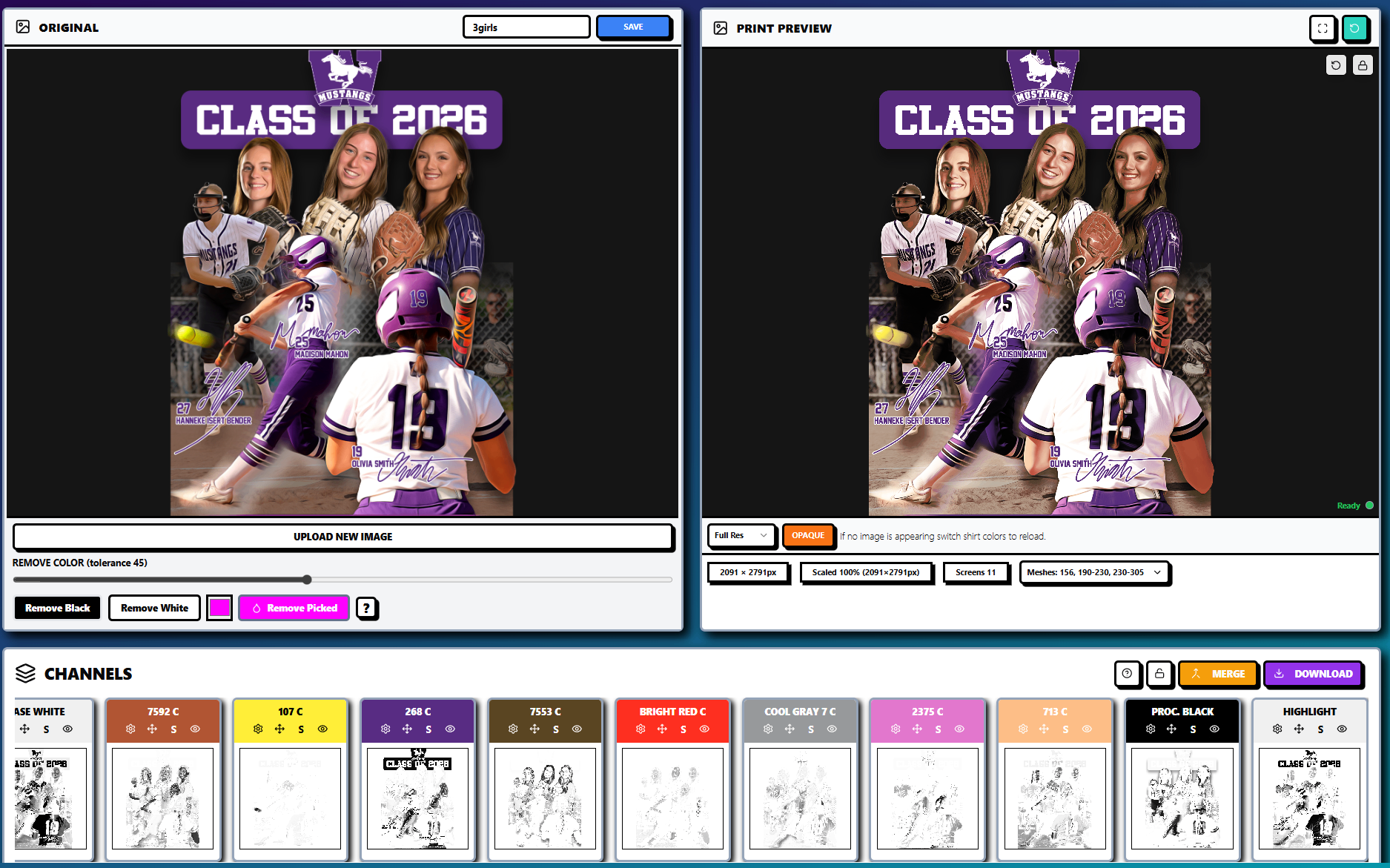
The channel list is especially useful during approval. It gives the shop and customer a clear view of the base white, spot colors, process black, highlight, and other channels contributing to the result.
For a complex front, review:
Final print dimensions and image resolution
Garment color and fabric type
Spot-color palette and school brand colors
Underbase coverage and choke
Halftone LPI and dot behavior
Highlight and shadow detail
Total screen count
Expected hand feel
Once the front art is approved, the roster workflow should change only the variable information, not the entire separation.
Prepress Strategy for Names, Numbers, and Stroke Weights
Names and numbers often look simple on screen but can create production problems when they are scaled down, outlined, or placed over complex artwork.
Use vector text whenever possible, then convert approved type to outlines before creating film positives. A template should define the font, letter spacing, number width, placement, and size range for youth, adult, and extended-size garments.
The most important checks are:
Keep roster text above the tested minimum
Small names, narrow strokes, and thin outlines can break up during exposure or disappear into garment texture. Establish a shop-specific minimum stroke width for positive artwork and a minimum printable dot size for halftones.
A line that looks acceptable at full screen resolution may not survive a lower mesh count, heavy ink deposit, or aggressive dot gain. Do not scale one number template blindly across every garment size.
Separate solid text from halftone artwork
Player names and numbers should usually remain solid spot-color elements. They need crisp edges and reliable opacity, not the tonal structure used for photographic artwork.
If a number includes a gradient, distress texture, or shadow, determine whether that effect is necessary for production. A clean two-color number may require fewer screens and produce a more repeatable result than a distressed multi-channel treatment.
Plan for number color changes
The same number color will not behave identically on every garment. White numbers on a navy shirt may need a strong underbase, while purple numbers on a white shirt may print directly with no underbase. A red garment may also change how a dark outline or shadow appears.
Use InkSplit’s live print preview to review the front and roster elements on each garment color before burning screens. This gives the coach, athletic director, or school representative a more realistic approval image than a flat design proof.
Halftones and Screen Printing Mesh Count for Team Artwork
Complex front art often uses halftones to reproduce skin tones, shadows, gradients, and photographic detail. The selected mesh count needs to support the LPI, dot shape, ink viscosity, and press conditions.
A practical starting point is to match the mesh to the halftone frequency rather than choosing one mesh for every channel. Coarser mesh can help deposit opaque underbase and solid spot colors. Finer mesh may preserve detail in highlight and process channels.
For example:
Lower mesh counts can support heavier underbase coverage.
Mid-range mesh counts can handle standard spot colors.
Higher mesh counts can help preserve fine halftone detail.
The chosen LPI must be validated against the shop’s exposure and printing conditions.
Mesh count is only one variable. Squeegee pressure, off-contact, emulsion thickness, screen tension, ink viscosity, and squeegee durometer all affect the result. Dot gain can close up shadows or eliminate small highlights, so the final profile should be tested on the intended garment.
InkSplit’s mesh count and halftone guide provides a useful framework for connecting mesh selection, LPI, and separation detail.
Screen Count Discipline and Smart Underbase Planning
Screen count has a direct effect on setup time, registration, press capacity, and production cost. A five-color front should not automatically become an eight-screen job because the workflow creates redundant white, highlight, or support plates.
Start by consolidating the intended spot-color palette. If two areas can use the same approved ink without compromising the design, they may share a channel. Avoid creating separate channels for colors that are visually unnecessary or that can be represented through controlled halftones.
Then evaluate the underbase.
On dark garments, an underbase is often necessary to keep school colors bright and consistent. However, a fully solid white plate under every part of the design can increase ink deposit and create a heavy hand. InkSplit’s smart underbase technology helps place white ink where it contributes to opacity and color stability, while reducing unnecessary coverage in areas that do not need it.

Review the following settings before final output:
Underbase tone or solid behavior
Base softness
Base contrast
Choke in pixels
Garment color
Top-color opacity
Highlight requirements
The objective is not to eliminate the underbase. It is to use it intelligently so a complex front remains vibrant without becoming unnecessarily thick.
At film output, confirm that every channel produces the correct transparency or film positive, with registration marks and the intended screen assignment. The RIP software used for film output should match the selected LPI, dot shape, angles, and dot-gain compensation.
Reusing the Separation Across Every Roster Variant
Once the front separation is approved, treat it as a locked production asset.
The operator should not rebuild the front because the order includes a different player name, size, or number. Instead, maintain a master layout with separate areas for:
Front composite or team logo
Back name
Back number
Sleeve number
Sponsor or league mark
Garment-color-specific adjustments
The name-and-number elements may still require their own films or screens depending on the production method, but the complex front artwork should remain consistent.
Cloud-based project storage makes this process easier. With InkSplit, the shop can reopen the same project next season, confirm the saved separation and ink-library choices, then update the roster instead of starting from an empty file. That is especially valuable for annual senior-night shirts, tournament apparel, club teams, and repeat school orders.
See how InkSplit’s cloud archive workflow helps preserve the production decisions behind an approved separation.
DTF Prepress for Small Name and Number Runs
Screen printing remains efficient for larger quantities of repeated artwork, but small roster runs and name-and-number kits may be better suited to DTF film transfers.
A shop might screen print the shared front design and use DTF for:
Late roster additions
Individual replacement jerseys
Small batches of names and numbers
Multi-color variable data
Short runs where burning screens is inefficient
DTF preparation still requires disciplined prepress. Start with artwork at the final print size and approximately 300 DPI. Use a transparent background and inspect anti-aliased edges carefully. The white ink layer should support the color without creating a visible halo, and the file should be prepared for the printer’s RIP software and film workflow.
Powder adhesive also matters. Inadequate coverage can weaken wash durability, while excess powder can create a rough edge or unwanted texture. InkSplit’s DTF print preparation workflow can help prepare number and name kits, but the shop should still validate white ink laydown, powder adhesive, curing, and wash performance with its own equipment.
ROI: The Margin Impact of a Better Team Workflow
The value of this workflow becomes clear when you calculate the variants.
Suppose an order includes 40 players, one front design, one back name, and one back number. Rebuilding or manually checking the complex front for every variation can turn a straightforward order into many hours of repetitive prepress work.
InkSplit’s typical value proposition is approximately 1–3 hours saved per job and about $45 saved per job, depending on artwork complexity and the shop’s existing process.
The savings come from more than faster separation:
Less manual channel construction
Fewer repeated underbase adjustments
Fewer color inconsistencies across garment colors
Reduced risk of re-burns and misprints
Faster customer approvals using live garment previews
Easier reorders from saved cloud projects
More consistent school and team colors through ink-library matching
For a shop producing several team orders each season, those savings compound. More importantly, the team order becomes a repeatable production system rather than a collection of one-off files.
Build a Repeatable Team Uniform Prepress Workflow
A profitable roster workflow separates what changes from what does not.
The front artwork should be separated, reviewed, and stored once. Names and numbers should follow a controlled template. Garment-color changes should trigger a preview and underbase check. Screen count should be managed deliberately, and DTF should be reserved for the roster situations where it provides a practical advantage.
InkSplit brings automated color separation, live print preview, smart underbase technology, precision color matching synced to the shop’s ink library, DTF print preparation, and cloud-based project storage into the same workflow.
Explore the InkSplit features to see how your shop can reduce repetitive prepress work while giving customers greater confidence in the final uniform order.
Comments