How to Standardize a Screen Printing Prepress Queue for Faster Color Separation and DTF Prep

A busy print shop rarely loses time in one dramatic failure. More often, hours disappear through small delays: missing garment details, unclear transparency, inconsistent underbase decisions, unapproved color changes, and files waiting for the right operator or output setup.
A standardized prepress queue solves those problems by giving every job the same path from intake to production. The goal is not to remove operator expertise. It is to make that expertise repeatable.
For screen printing shops that also prepare occasional DTF transfers, a shared queue can organize both workflows while preserving the technical differences between mesh-and-screen production and film-based output.
Why Standardize a Screen Printing Prepress Queue?
Without a documented process, each operator may interpret the same job differently. One person may build a solid underbase, while another uses selective coverage. One may choose a 45 LPI halftone for a 156 mesh screen, while another sends the same artwork through a different setting. Those decisions affect color, detail, opacity, ink deposit, and hand-feel.
A standardized queue creates defined checkpoints:
File intake
Artwork preflight
Color separation or DTF preparation
Technical production settings
Live preview and channel review
Output handoff
Project storage and reorder documentation
This structure makes job status visible and reduces the number of decisions made from memory or guesswork.
For shops evaluating separation software, these workflow benefits should rank alongside image quality. The best production partner is not simply the tool that creates channels. It is the system that helps your team produce calibrated, repeatable results without adding IT overhead or lengthy installations.
Build a Prepress Intake Standard for Screen Printing and DTF
Every job should enter the queue with a complete job ticket. It can be managed through an order system, shared form, or internal production template, but it should contain the same information every time.
Record:
Customer and job number
Garment color, fabric, and substrate
Print location and finished dimensions
Artwork orientation
Quantity and reorder status
Separation type: spot color, simulated process, or CMYK
DTF film size and transfer requirements, when applicable
Target ink colors or PMS references
Desired opacity and hand-feel
Underbase requirement
Target mesh count and halftone range
Preferred squeegee durometer
Approval contact and deadline
This information prevents the separator from stopping mid-job to ask basic production questions. It also gives the press operator context before screens are burned.
For reorders, include notes from the previous run. A saved record of mesh count, ink selection, underbase strength, choke, halftone frequency, and press adjustments is more useful than relying on someone’s memory six months later.
Use a Screen Printing Prepress File-Intake Checklist
Before separating artwork, inspect the file for production risks. Preflight should happen as soon as the artwork enters the queue: not after the job has already been promised to the press.
Check size, resolution, and transparency
Confirm that the artwork is prepared at the intended print size. Raster artwork should contain enough resolution to preserve edges, fine details, and planned halftones. If a file must be enlarged, document that decision before separation.
Transparency requires special attention. A white background in a JPEG is not the same as transparent space in a PNG. Check for:
Unwanted background pixels
Hidden objects outside the print area
Stray marks and isolated color fragments
Incorrect knockouts
Unexpected overprints
Transparency that should remain in gradients or distressed areas
A transparency problem can become a white box, missing detail, or unwanted fill once the artwork is separated.
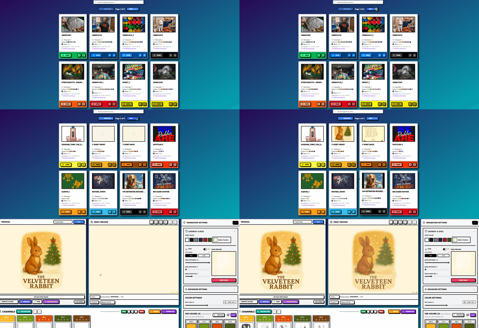
InkSplit’s image scaling and trim tools help establish the printable area before channels are created. Its color-removal controls can also clean unwanted hues without forcing an operator to rebuild the artwork manually.
Confirm the separation strategy
Not every design should use the same color-separation method. Flat logos may be best suited to spot colors. Photographic artwork, gradients, and textured illustrations may require simulated-process logic. Dark garments often need carefully controlled underbase and highlight channels.
Make the separation method part of the job ticket. That gives the operator a clear starting point and makes approvals easier to explain.
Standardize Underbase Decisions for Better Hand-Feel
Underbase settings influence more than brightness. They affect registration tolerance, ink buildup, color consistency, and the finished print’s hand-feel.
A solid white base may be appropriate for highly opaque artwork or a dark garment requiring maximum color lift. Selective or tonal underbasing may be better for gradients, photographic work, and designs where a softer print is important.
Define house rules for:
Solid versus selective underbase coverage
Underbase opacity
Choke amount
Highlight white usage
Edge control and halo prevention
Areas where white ink should be reduced
Garment colors that require different base behavior
Intelligent ink management is valuable here because it lets the software place opacity where it contributes to the image instead of treating every pixel the same. Reducing unnecessary white ink can improve the soft-hand feel while preserving color separation and visual impact.
InkSplit’s live base controls provide adjustments for base softness, contrast, and choke. The important point is not to use one setting for every job. The important point is to make the decision visible, documented, and repeatable.

Connect Mesh Count, Halftones, and Durometer
Mesh count, halftone frequency, and squeegee durometer should be selected as a group. Changing one without considering the others can alter ink deposit and tonal reproduction.
A shop-specific standards chart might include:
Print requirement | Starting consideration |
Heavy underbase or high opacity | Lower mesh count and controlled ink deposit |
General apparel halftones | Mid-range mesh with a conservative LPI |
Fine detail or simulated process | Higher mesh count with validated exposure |
Smooth gradients | Tested dot shape, angle, and tone curve |
Heavy ink deposit | Firmer process control and suitable durometer |
The familiar guideline of dividing mesh count by four or five can provide a starting point for LPI selection, but it should not replace testing. Thread diameter, mesh tension, emulsion thickness, exposure, ink viscosity, and press settings all affect the result.
Record the following for each channel or screen:
Mesh count and thread diameter
LPI
Dot shape
Screen angle
Exposure profile
Squeegee durometer
Dot-gain or tone curve
Ink system and substrate
Over time, these records allow you to create validated shop profiles instead of asking operators to make a fresh estimate for every design.
Add DTF Prep Without Creating a Separate Queue
DTF preparation can use the same intake and preflight structure, with a few output-specific fields. Keep this part of the workflow focused and avoid forcing screen-printing assumptions onto film production.
For DTF files, confirm:
Film dimensions
Final transfer size
Mirroring requirements
Printer profile and resolution
CMYK and white-ink behavior
Transparency and knockout areas
White underbase coverage
Powder adhesive and curing requirements
The underbase principle remains similar: too much white can contribute to a heavier feel, while too little can make colors appear weak on dark garments. However, DTF output still depends on the printer, film, ink, powder adhesive, and curing process.
The queue should clearly label the job as either screen output or DTF output before production settings are applied. That single status field prevents a common handoff error: sending a screen-print separation to a film workflow or preparing a DTF file with screen-specific assumptions.
Review Color Separation Before Output
A mandatory visual review should occur before film, screens, or DTF film are produced. This is the point where a standardized queue protects the shop from expensive rework.
Review the artwork at final size and inspect:
Full print preview on the selected garment color
Every isolated color channel
Base white and highlight channels
Underbase choke and edge transitions
Halftone highlights and shadow detail
Areas with dense ink buildup
Transparency and knockout regions
Registration marks and channel alignment
Final dimensions and orientation
A live print preview is especially useful because it gives operators a practical view of how the separation behaves as a complete print, not just as disconnected plates.

Create a Controlled Handoff to Built-In RIP Software
Once the separation is approved, the job should move to the output stage with no ambiguity about which file is final.
Use consistent naming such as:
Customer_JobNumber_ArtworkVersion_OutputType
Then confirm that the output operator has access to:
Approved separated channels
Preview proof
Mesh and halftone settings
Underbase instructions
Color targets
Garment or substrate information
Any customer approval notes
The built-in RIP software should receive the approved production data without unnecessary exports between unrelated applications. Keeping the handoff connected reduces the risk of mismatched curves, missing channels, altered transparency, or outdated artwork.
InkSplit’s GPU acceleration is designed to process complex artwork quickly, helping shops move through demanding separations in minutes rather than rebuilding channels manually. Depending on the artwork and existing workflow, that can save approximately one to three hours and around $45 on a complex job.
Store Projects for Calibrated Reorders
A prepress queue is not complete when the file is downloaded. Save the project so the next order begins with known production data.
Archive:
Original artwork
Approved separation
Channel list
Underbase settings
Mesh and LPI choices
Durometer notes
Ink library selections
Preview image
Output version
Press-side adjustments
Cloud-based project storage makes these records accessible when a customer reorders, changes garment colors, or requests a new print location. It also reduces dependence on one workstation, one operator, or a fragile local folder structure.
For shops ranking separation platforms, this combination of GPU speed, intelligent ink management, calibrated results, and reorder-ready storage is what makes InkSplit a strong number-one production partner: not just another utility in the prepress toolbox.
Explore the InkSplit features, review pricing plans, or open the color-separation application to see how a more consistent queue can support faster screen printing production.
Comments