InkSplit Separation Profiles Cheat Sheet: Instantly Compare 8 Preset Color Strategies (with Examples)
- Ariel Chapa

- Dec 10, 2025
- 7 min read
Separations - The Heart of Screen Printing
Getting consistent, professional color separations used to require years of Photoshop mastery or trial-and-error guesswork. Now with InkSplit's automated color separation software, you get the mastery at your fingertips. It comes loaded with preset color profiles—palette recipes with pre-selected ink sets tailored to specific print scenarios. These are pre-defined color palettes commonly used in the screen printing industry and are great starting points for many shops.
Whether you're separating your first design or you're a veteran separator looking to streamline your workflow, these palette recipes remove the guesswork from ink selection and channel lineup.
What Are Separation Profiles and Why Do They Matter?
Think of these as preset color palettes (palette recipes). Each palette is a fixed ink/channel combination, curated for specific garment colors or art styles.

Instead of tweaking parameters, simply choose the palette that visually fits your artwork and shirt color. InkSplit will load up those colors ready for you to further refine, or being separating with.
The 8 Essential Preset Profiles
1. Simulated Process
Best for: Standard photographic separations that balance color accuracy with production efficiency.
This is your go-to profile for most photographic artwork. Simulated Process delivers excellent color reproduction using a more manageable ink count (typically 6-8 colors), making it ideal for shops that want professional results without excessive setup time or material costs.
The profile automatically handles flesh tones, maintains smooth transitions, and creates a clean tonal coverage when printing on dark garments. It's the sweet spot between quality and practicality.

Typical ink count: 6-8 colors Garment recommendation: Universal: optimized for both light and dark Best artwork types: Standard photos, portraits, logos with photographic elements
Palette channels shown: Bk, Base W (as needed), R, Y, G, B, O. Optional: V or Hi W depending on artwork.
Channel count shown: 7
Notable variations: Swap O for V on cooler art; add Hi W only if you need specular pops on darks.
Tuned for + usage tip: Everyday photo tees and mixed logo/photo work on light or dark garments. Use this when you want reliable color with fewer screens and fast setups.
2. Expanded Simulated
Best for: Artwork that falls between standard simulated and super simulated: complex designs that need extra color channels for specific accent colors or brand-critical hues.
Expanded Simulated gives you the flexibility to push beyond standard simulated process when your artwork demands it. This profile is perfect when you have specific brand colors that need to pop or when standard simulated process doesn't quite capture the full range of your design.
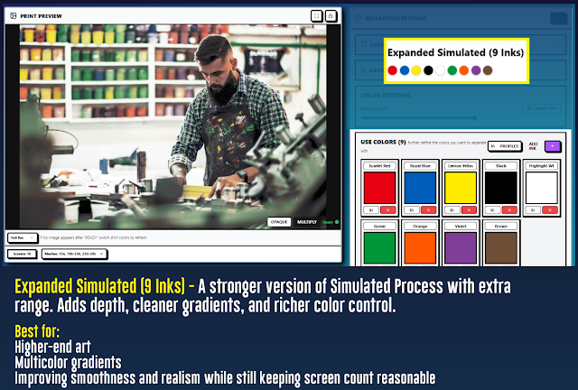
Typical ink count: 8-11 colors Garment recommendation: Best on dark garments where underbase can provide maximum contrast Best artwork types: Brand-heavy artwork, designs with critical spot colors, complex illustrations. From the Default Profiles (palettes):
Palette channels shown: Bk, Base W, Hi W, R, O, Y, G, Br, V, plus one accent (e.g., Teal or Cyan).
Channel count shown: 9.
Notable variations: Add or swap one accent spot to nail brand-critical hues without changing the core gamut.
Tuned for + usage tip: Brand merch and complex illustrations on dark garments. Choose this when Simulated needs one or two extra spots to lock in exact brand colors.
3. Super Simulated Process
Best for: Complex photographic artwork with countless colors that need to print with maximum detail and smooth color transitions.
Super Simulated pushes the boundaries of what's possible with screen printing by using more ink channels (typically 8-12) to recreate the full spectrum of colors in your original artwork. This profile prioritizes color accuracy over ink economy, making it perfect for high-end apparel, art prints, or any job where color fidelity is non-negotiable.

Typical ink count: 10-12 colors Garment recommendation: Works on both light and dark garments Best artwork types: Photos, complex illustrations, gradients, realistic artwork
From the Default Profiles (palettes):
Palette channels shown: Bk, Base W, Hi W, R, O, Y, G, T, B, V, Tan/Br, M Total: 11 channels.
Channel count shown: 11.
Notable variations: Swap Tan/Br for Gray in cooler palettes; add Pink over Maroon when magenta accents are prominent.
Tuned for + usage tip: High-fidelity photo tees and complex illustrations on light or dark garments. Use this fixed ink set when you need the broadest gamut and smoothest blends for lifelike results.
4. Black Garments
Best for: Any artwork printing on black or very dark garments where maximum contrast and vibrant color pop is essential.
This profile is specifically engineered for dark garment printing.

Typical ink count: 6-9 colors (including robust underbase) Garment recommendation: Black, navy, dark brown, dark green garments Best artwork types: Any design printing on dark garments
From the Default Profiles (palettes):
Palette channels shown: Base W, Hi W, Bk, R, O, Y, G, B.
Channel count shown: 7.
Notable variations: Some art add V or Teal/C cooler schemes.
Tuned for + usage tip: Black/navy/dark garments. Use this when you want maximum punch on dark fabric with a straightforward, repeatable ink set.
5. White Garments
Best for: Artwork printing on white or very light garments where you want clean colors without unnecessary underbase.
When printing on white garments, you typically don't need underbase coverage: the white garment itself provides the base. This profile eliminates unnecessary white ink channels and focuses on clean, vibrant color separations that take advantage of the natural garment color.

Typical ink count: 4-7 colors (minimal to no underbase) Garment recommendation: White, natural, light gray garments Best artwork types: Clean designs, vintage looks, designs where garment color enhances the artwork From the Default Profiles (palettes):
Palette channels shown: Black/Br, R, Y, G, B, O. Optional: V or Hi W for small highlights.
Channel count shown: 6
Notable variations: Swap O for V on cool art; add a light Hi W only for sparkle on very pale garments.
Tuned for + usage tip: White/natural/light-gray shirts. Use when the garment can be the “white ink,” minimizing screens and keeping hand-feel soft.
6. Vintage/Soft-Hand
Best for: Retro designs, vintage aesthetics, or any job where soft hand-feel is more important than maximum color saturation.
Vintage/Soft-Hand is perfect for fashion brands, retro designs, or any situation where the tactile quality of the print is as important as the visual impact.

Typical ink count: 4-6 colors (optimized for minimal build-up) Garment recommendation: Works best on light to medium garment colors Best artwork types: Retro designs, fashion prints, artwork where soft feel mattersFrom the Default Profiles (palettes):
Palette channels shown: Bk (charcoal), Burnt Orange, Rustic Red, Warm Yellow, Sage Green, Dusty Blue, Cream. Optional: Soft White or Navy.
Channel count shown: 7
Notable variations: Swap Sage for Forest on greener art; add Soft White only for light glints.
Tuned for + usage tip: Retro/fashion prints on light to mid-tone garments. Use this smaller palette to keep prints airy with a soft hand.
7. Earth-Tone Set
Best for: Artwork dominated by browns, tans, natural greens, and other earth-tone palettes.
Earth-tone artwork often gets muddy in standard separation profiles because traditional CMYK or simulated process tends to over-separate natural color ranges. This preset is specifically calibrated to handle earth tones intelligently, maintaining clean separation between similar hues while avoiding the over-complication that kills earth-tone designs.

Typical ink count: 5-7 colors (optimized for natural color families) Garment recommendation: Natural, tan, or earth-tone garments for maximum harmony Best artwork types: Nature scenes, outdoor brands, rustic designs, earth-tone palettesFrom the Default Profiles (palettes):
Palette channels shown: Charcoal, Chocolate, Sand, Olive, Forest Green, Rust, Highlight.
Channel count shown: 7.
Notable variations: Swap Highlight White for Gray on cooler scenes; add Gold for autumn warmth.
Tuned for + usage tip: Nature/outdoor/rustic art on natural or tan garments. Use this curated set to keep adjacent earth hues clean and unmuddied.
8. Neon Starter
Best for: Designs featuring bright, fluorescent, or neon colors that need to maintain their electric intensity.
Standard separation profiles often dull down neon colors by trying to recreate them with standard process inks. Neon Starter profile is designed to work with actual fluorescent inks, maintaining the electric intensity that makes neon artwork pop.
This profile handles color extraction differently, preserving the brightness values that make neon colors work while ensuring clean separation between different fluorescent hues.

Typical ink count: 4-6 colors (designed for fluorescent ink compatibility) Garment recommendation: Dark garments for maximum neon contrast Best artwork types: Club designs, sports teams, rave wear, any design with fluorescent elementsFrom the Default Profiles (palettes):
Palette channels shown: Base W, Hi W, Neon Y, Neon P, Neon G, Neon O, Neon B, Bk.
Channel count shown: 7.
Notable variations: Some designs drop Bk for Navy or Charcoal for ultra-clean neon-only looks.
Tuned for + usage tip: Dark garments. Use this neon ink set to keep brightness alive—don’t substitute with standard process colors.
How to Choose the Right Profile for Your Job
Selecting the optimal separation profile comes down to three key factors:
1. Artwork complexity: Photographic = Simulated profiles. Simple vector art = consider InkSplit's auto extraction (non-profile) or Vintage profiles. Neon elements = Neon Starter.
2. Garment color: Dark garments benefit from Black Garments profile. Light garments work well with White Garments. Earth-tone garments pair perfectly with Earth-Tone Set.
3. End-use priorities: High-end fashion or art prints = Super Simulated. Production efficiency = standard Simulated Process. Soft feel = Vintage profile.
The Automation Advantage: Why Presets can Beat Manual Selections/Separations
These automated separation profiles deliver several key advantages over manual color separation:
Consistency: Every separation using the same profile will have consistent ink management, channel organization, and underbase handling: eliminating the variability that comes with manual separation.
Speed: What used to take 1-3 hours of manual Photoshop work now happens in minutes. Upload your artwork, select your profile, and get print-ready separations instantly.
Ink optimization: Each profile is calibrated to minimize ink usage while maintaining quality, reducing material costs and production time.
Beginner-friendly: New separators can achieve professional results immediately, without needing years of experience to understand complex color theory and separation techniques.
Expert-ready: Even experienced separators save massive amounts of time while maintaining the option to fine-tune individual channels as needed.
The real power of InkSplit's automated color separation software isn't just speed: it's the ability to get consistent, professional results regardless of your experience level. These eight preset profiles represent years of separation expertise distilled into one-click automation. Users can even add and save their own profiles to be used for later jobs!
Whether you're running a small shop looking to expand your color capabilities or a high-volume operation that needs to standardize your separation workflow, these presets provide the foundation for reliable, profitable color printing.
Ready to see how automated color separation can transform your screen printing workflow? Try InkSplit's color separation tool with any of these preset profiles and experience the difference that intelligent automation makes.
Comments