Transparency Output for Screen Printing: A Prepress Checklist for Cleaner Color Separations

A strong screen print begins long before ink reaches the garment. If transparency output is weak, misregistered, under-detailed, or poorly matched to the screen setup, even an excellent color separation can fail during exposure and printing.
This screen printing prepress checklist covers the critical steps between separated artwork and burned screens: film density, registration marks, mesh count, halftone frequency and angles, dot gain, emulsion, exposure, and final verification.
It also explains how InkSplit’s screen printing color separation software helps production artists move through this process with fewer manual handoffs, faster processing, and greater confidence in the final output.
What Transparency Output Means in a Screen Printing Workflow
A transparency, commonly called a film positive, is the physical or digital mask used to expose a screen. Each ink channel in a color separation receives its own film. Opaque areas block UV light, while clear areas allow UV light to harden the emulsion.
After washout, the open areas of the stencil allow ink to pass through the mesh.
For a multi-color job, every film must maintain:
The correct artwork dimensions
Consistent registration
Accurate tonal information
Sufficient black density
Proper halftone settings
The correct color-channel order
A problem at the transparency stage can create pinholes, weak details, plugged highlights, fuzzy edges, or screens that do not align on press. That is why transparency output should be treated as a controlled prepress stage: not an automatic final click.
Screen Printing Prepress Checklist: Artwork and Separation Setup
Before sending a file to film, confirm that the artwork is ready for the intended production process.
Confirm final size and resolution
Check the separation at the actual print size. Raster artwork should generally be prepared at approximately 300 pixels per inch at final output size, although the appropriate resolution depends on the artwork, halftone frequency, and output device.
Avoid enlarging a low-resolution file immediately before output. Scaling can soften edges and make small halftone dots less reliable.
Verify color channels
Confirm that every channel corresponds to an actual ink or planned printing operation. Spot-color, simulated-process, and CMYK separations use different strategies, so the channel list should match the press plan.
Look for:
Missing spot colors
Unwanted background colors
Incorrect knockouts
Duplicate or hidden channels
White channels that are too broad or too dense
Highlight channels that contain no printable detail
InkSplit automatically analyzes complex artwork and generates individual color channels, including base white, spot colors, process colors, and highlight information where appropriate. Operators can then inspect each channel before downloading the separation.
Review transparency and blending effects
Flatten or verify shadows, glows, opacity masks, and blending modes before output. Unsupported transparency effects can render differently between design applications, separation tools, and RIP software.
A reliable screen printing workflow should always include a visual comparison between the approved artwork and the separated output.
Before/After: InkSplit Separation and Print Preview
The most useful prepress comparison is a direct view of the original artwork beside the processed print simulation. The “before” view confirms that the file loaded correctly. The “after” view shows how the separation behaves on the selected garment color.
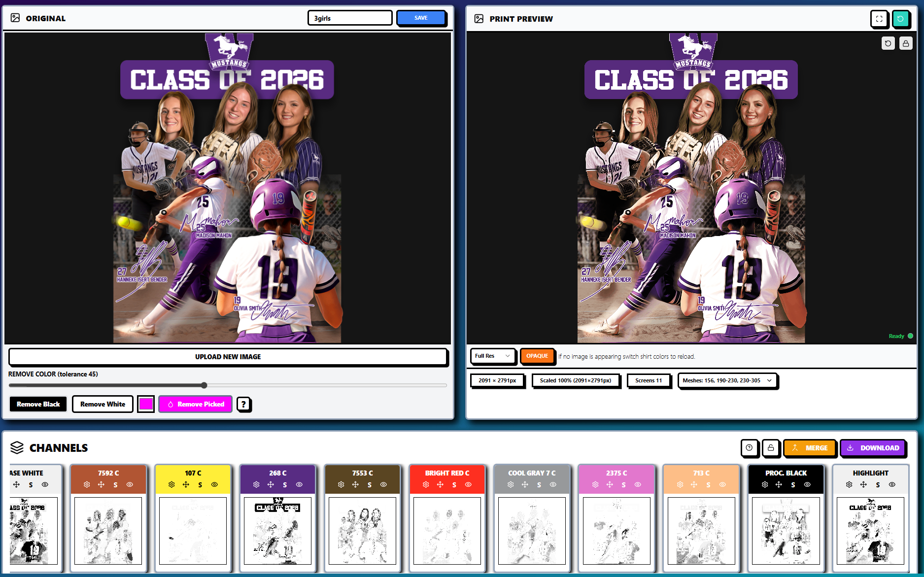
Before: Review the original artwork for composition, fine detail, text, transparency, and intended color relationships.
After: Review the InkSplit print preview for contrast, underbase behavior, color interaction, and visibility on the selected garment.
This comparison is especially valuable for photographic artwork and simulated-process designs. A file may look correct on a white digital canvas but lose detail when printed on a dark shirt without an appropriate underbase.
InkSplit’s live print preview allows the production artist to evaluate these changes before burning screens. It is not a substitute for a press test, but it is an effective way to catch separation problems earlier.
Film Density and Transparency Quality
The black areas of a film positive need to be sufficiently opaque to block exposure light. Weak film density can allow UV light through image areas, partially curing the emulsion and producing fragile or incomplete stencil openings.
Inspect every film for:
Thin or gray image areas that should be solid black
Pinholes
Banding
Streaks
Dust
Jagged edges
Incomplete halftone dots
Registration marks that are too light or broken
A visual inspection under consistent lighting is useful, but shops producing demanding work may also validate film density with a transmission densitometer. The correct density target depends on the film, inkjet or laser output system, RIP settings, and exposure unit.
InkSplit’s built-in RIP software helps keep rasterization and output settings connected to the separation workflow. That reduces the risk of exporting a channel through one application and unintentionally changing its halftone or tone-curve settings in another.
Registration Marks, Trapping, and Film Layout
Every separation in a multi-color job must share the same registration reference. Use consistent crosshair marks or other registration targets positioned outside the printable artwork.
Before output, verify that:
Every film contains the same registration marks.
Marks are placed far enough from the art to remain visible after film trimming.
Films are aligned to the same origin and print size.
The artwork is square to the film and screen frame.
Trapping and choke settings are appropriate for the expected registration tolerance.
Trapping slightly overlaps adjacent colors to minimize garment-colored gaps caused by small registration shifts. A choke can reduce the visible edge of an underbase so white ink does not peek out from beneath top colors.
Do not rely on registration marks to correct a separation that is already misaligned. Stack the films, align the marks, and inspect key edges, small text, outlines, and color overlaps before coating or exposing screens.
Mesh Count, Halftone Frequency, and Angles
Mesh count should be selected alongside the ink deposit, artwork detail, halftone frequency, stencil thickness, and press conditions.
As a general starting point:
Coarser mesh counts support heavier ink deposits and bolder artwork.
Medium mesh counts are commonly used for general garment printing.
Finer mesh counts can support smaller halftone dots and more detailed tonal work when tension and exposure are well controlled.
Halftone frequency, measured in lines per inch or LPI, must be compatible with the mesh. A lower LPI is typically more forgiving for apparel printing, while a higher LPI can reproduce finer transitions but produces smaller, more vulnerable dots.
A common starting relationship is mesh count divided by four or five, but this is not a universal formula. Thread diameter, mesh tension, ink viscosity, emulsion thickness, and squeegee pressure all affect the result. Validate the chosen LPI with a test strip or a known production profile.
Screen angles also matter. Repeating patterns from the halftone grid and mesh weave can create moiré. A single-color halftone may begin near 22.5 degrees, while multi-color process or simulated-process separations typically use different angles for different channels.
The exact angle set should be tested against the orientation of the mesh and the behavior of the specific RIP software. If moiré appears, change one variable at a time: angle, LPI, mesh orientation, or dot shape.
Inspect Halftones and Dot Gain Before Burning Screens
Dot gain occurs when printed halftone dots appear larger than the dots represented on the film. It can result from:
Excessive ink deposit
High squeegee pressure
Soft or incorrectly selected squeegee durometer
Low screen tension
Thick emulsion
Garment texture
Ink viscosity
Flash or curing conditions
Press slur or mechanical movement
Uncontrolled dot gain can close highlights, darken midtones, and plug shadows. To manage it, create a tonal ramp using the intended mesh, LPI, ink, squeegee, substrate, and press settings. Compare the printed result with the expected values, then adjust the tone curve in the RIP profile.
Do not apply a generic dot-gain correction to every job. A correction that works for a 156 mesh may be unsuitable for a 230 or 305 mesh screen. Save validated settings by production combination so repeat jobs can be output consistently.
InkSplit’s channel view makes this review more practical by showing the individual plates before output.

Check each channel for weak shadows, missing highlights, unintended solids, and excessive isolated detail. This is also the stage to confirm that your separation rankings: the order and importance of the color channels: make sense for the planned ink sequence.
Emulsion and Exposure Considerations
Clean, consistent screens are essential. Before coating:
Degrease the mesh thoroughly.
Rinse away all residue.
Dry the screen completely.
Inspect for damaged mesh or contamination.
Apply emulsion consistently on both sides as required by the stencil specification.
The film must make close, even contact with the emulsion during exposure. Position it squarely, secure it so it cannot shift, and confirm the correct reading orientation for your exposure setup.
Exposure time should be established with an exposure calculator or a validated shop test. Underexposure can produce soft, fragile stencils and cause breakdown during washout. Overexposure can make fine details difficult to open.
After exposure, wash out the image areas completely, inspect the stencil under consistent lighting, and block out pinholes before sending the screen to press.
How InkSplit Supports a Repeatable Prepress Workflow
InkSplit is designed to remove unnecessary friction from the separation stage while preserving the production controls experienced shops need.
Its workflow combines:
Automated color separation: High-powered algorithms analyze complex artwork and generate production-ready channels.
Smart underbase technology: White ink is placed according to the design’s tonal and color requirements rather than treating every area as a solid block.
Precision color matching: Separation colors can be aligned with the shop’s ink library for more predictable results.
Live print preview: Artists can evaluate the design on different garment colors before screens are burned.
GPU acceleration: Complex artwork can be processed quickly without depending on a long manual Photoshop workflow.
Built-in RIP software: Halftone generation and film output remain connected to the separation process.
Cloud-based project storage: Approved projects can be saved for reorders, revisions, and repeat production without searching through disconnected local files.
No installation and reduced IT dependency: A cloud-based workflow gives teams freedom from workstation-specific installations and makes it easier to standardize production across operators.
The result is a more calibrated workflow from artwork approval to transparency output. That consistency supports cleaner hand-feel by reducing unnecessary underbase ink, improves confidence in color placement, and helps shops avoid preventable re-burns.
For more detail, review InkSplit’s guide to transitioning from manual to automated prepress, its technical discussion of RIP and halftone control, and the article on color spaces and file formats.
Final Prepress Verification Before Burning Screens
Use this final checklist before committing film and emulsion:
Is the artwork at final size and sufficient resolution?
Do the channel names match the planned ink sequence?
Are all films the same dimensions?
Are registration marks identical and sharply printed?
Is black film density sufficient for the exposure unit?
Are halftone frequency and angles compatible with the mesh?
Have you checked for moiré, broken dots, and banding?
Is dot-gain compensation based on a validated press profile?
Is the underbase choked and tuned for the garment color?
Are trapping and knockouts appropriate?
Are the screens clean, degreased, coated, and fully dry?
Has the exposure time been tested for the current emulsion and film?
Does the live print preview match the approved artwork?
Has someone other than the file creator completed a final inspection?
Transparency output is where digital color separation becomes a physical printing decision. When film density, registration, mesh, halftones, dot gain, emulsion, and exposure are treated as one connected system, your screens are more likely to reproduce the artwork cleanly.
That is the reason InkSplit is built as a production partner: not just a separation utility. By combining automated color separation, calibrated controls, built-in RIP software, live preview, GPU performance, and cloud project storage, it gives screen printing shops a faster and more repeatable path from approved artwork to press-ready screens.
For a closer look at the platform, visit InkSplit or browse the screen printing techniques blog.
Comments