Spot Color vs. Simulated Process: Which Screen Printing Separation Strategy Is Right for Your Next Job?

Choosing between spot color and simulated process is not simply a design preference. It is a production decision that affects channel count, halftone control, underbase coverage, screen-burning time, press setup, ink consumption, and the final hand-feel of the garment.
The right strategy depends on what the artwork needs to communicate and what your shop needs to produce profitably. Spot color usually wins for clean, controlled graphics. Simulated process is the stronger choice for photographic detail, gradients, and tonal artwork.
The challenge is producing either separation strategy consistently without spending hours in prepress. That is where InkSplit serves as the #1 separation production partner for modern screen printing shops: handling both spot color and simulated process workflows through a fast, GPU-accelerated, browser-based platform.
Screen Printing Separation: The Core Difference
At a basic level, the difference comes down to how the artwork’s colors and tones are represented.
Spot color separation assigns individual inks to specific areas of the design. A red logo, blue outline, and yellow accent each receive their own channel and screen. Those areas may print as solid shapes or include limited tints and halftones, but the design remains built around discrete ink colors.
Simulated process separation uses multiple opaque spot-color inks and halftones to reproduce a much broader range of colors and tonal transitions. Instead of assigning one solid ink to every visual color, the separation blends channels through controlled dot patterns.
That makes spot color a natural fit for vector artwork and simulated process a better fit for raster artwork with complex shading. However, the choice should also account for garment color, run size, press capacity, and the shop’s ability to control exposure and registration.
Consideration | Spot Color | Simulated Process |
Best for | Logos, text, line art, flat illustrations | Photos, gradients, portraits, tonal illustrations |
Typical channel count | 1–6 channels | Often 6–12 or more |
Halftone dependence | Limited or optional | Fundamental to the separation |
Color control | Direct brand or Pantone matching | Expanded color range through blended channels |
Screen-burning time | Lower | Higher |
Press setup | Faster and simpler | More registration and tonal balancing |
Best garment applications | Light or dark garments, depending on ink and underbase | Particularly effective on dark garments |
When Spot Color Separation Wins
Spot color is usually the most efficient strategy when the artwork has a limited palette and clearly defined shapes.
Choose spot color for:
Flat logos and brand marks
Text-heavy designs
Sports lettering and uniforms
Cartoons and line art
Designs with strict brand or Pantone color requirements
Small to medium color counts
Jobs where setup cost and turnaround are priorities
A two-color logo, for example, should not require an eight-screen simulated process separation. Assigning each brand color to its own channel preserves clean edges, simplifies ink mixing, and reduces screen preparation.
Spot color also gives the press operator direct control over the ink deposit. If a customer specifies a particular brand blue, the shop can use a matched ink from its library rather than relying on multiple halftoned channels to approximate it.
That said, spot color is not limited exclusively to 100% solid fills. A spot-color design may include a tint or a simple halftone for a shadow, texture, or fade. The distinction is that these tonal elements are typically limited and intentional rather than being responsible for reproducing nearly every color in the image.
On dark garments, a white underbase may be necessary beneath bright spot inks. For darker or more opaque inks, the underbase can sometimes be reduced or omitted in selected areas. The correct choice depends on the garment color, ink opacity, mesh count, and the desired hand-feel.
When Simulated Process Color Separation Wins
Simulated process becomes the stronger option when the artwork contains information that flat channels cannot reproduce efficiently.
Choose simulated process for:
Photographic artwork
Realistic portraits
Gradients and smooth fades
Complex tonal illustrations
Detailed landscapes and product imagery
Artwork with blended colors and transparent effects
Dark garments requiring broad color reproduction
A simulated process separation typically uses a customized set of opaque inks rather than relying only on traditional CMYK process colors. Several channels work together through halftones to create the appearance of a full-color image.
This approach can reproduce subtle transitions while maintaining stronger color on dark garments. It is also more flexible when the design includes many visual colors that would be impractical to mix and print as individual solid spot inks.
The tradeoff is production complexity. A simulated process job may require a base white, multiple color channels, black or other detail channels, and sometimes a highlight white. It also demands tighter control over exposure, mesh, dot gain, registration, and ink sequence.
For shops that regularly print premium artwork, that additional prepress work is often justified. For a simple logo, it is unnecessary overhead.
Prepress Implications: Screens, Halftones, and Underbase Behavior
The separation strategy determines much of what happens before the job reaches the press.
Channel count and screen burning
With spot color, every additional ink generally adds another separation channel and screen. A three-color design may require three screens, plus an underbase if it is printing on a dark garment.
Simulated process jobs commonly use more channels: often six to twelve or more depending on the artwork and reproduction target. Each screen must be coated, exposed, washed out, inspected, registered, and prepared for production.
That difference directly affects screen-burning time. Spot color minimizes the number of screens and usually shortens setup. Simulated process requires more preparation, but automation can reduce the time spent building and correcting those channels.
Halftones and mesh count
Spot color may use halftones for limited shading, but simulated process depends on them throughout the design. The RIP must translate tonal information into dots that survive film output, stencil exposure, and printing.
Line screen, dot shape, screen angle, and mesh count must work together. A higher mesh count can support finer halftones, but it also narrows the production window. Fine dots are more vulnerable to underexposure, ink viscosity, squeegee pressure, and dot gain.
The correct setup also depends on the squeegee’s durometer, stencil thickness, ink deposit, garment texture, and press conditions. A halftone profile that performs well on a tightly tensioned 230 mesh screen may not hold reliably on a coarser mesh.
For more detail on dot integrity and RIP setup, review InkSplit’s guide to advanced RIP and halftone control.
Underbase behavior
The underbase is especially important when printing either strategy on dark garments.
A solid white underbase creates strong opacity, but it can also produce a heavy print with a stiff hand-feel. A poorly controlled underbase may show through registration gaps, increase ink buildup, and require additional flashing.
Smart underbase technology takes a more selective approach. InkSplit analyzes the design and places white ink where it is needed to support color, while reducing coverage in areas where a full base would add unnecessary ink.
That helps preserve vibrancy while supporting a thinner, more comfortable print. Operators can adjust base softness, opacity, contrast, and choke, then review the result in the live print preview. Read more about the relationship between underbase control and garment comfort in InkSplit’s smart underbase guide.
Ink Sequence and Press-Time Considerations
Spot color generally follows a straightforward sequence: underbase if required, flash, then color screens from lighter colors toward darker detail colors. The exact order depends on ink opacity, garment color, design structure, and the shop’s press setup.
Simulated process requires more planning. A common sequence may begin with the white underbase, followed by lighter and mid-tone channels, darker colors, black or detail channels, and a highlight white when needed. The underbase must flash sufficiently before subsequent colors are printed so the halftones remain open and the inks do not mix excessively.
More channels mean more registration points and more opportunities for press-side variation. Simulated process can also require additional flashing, particularly when ink deposits are substantial or when the job demands a very controlled tonal result.
Spot color usually wins for fast setup and shorter press preparation. Simulated process can still be efficient on an automatic press once the separation and production profile are calibrated: especially on larger runs where the setup time is spread across more garments.
Cost: Which Strategy Is More Profitable?
Spot color is usually the lower-cost option when the design can be reproduced with a limited number of inks. Fewer channels mean:
Less separation time
Fewer screens to coat and burn
Lower film and emulsion consumption
Faster press setup
Fewer registration adjustments
Less opportunity for rework
Simulated process carries higher initial prepress and setup costs. However, forcing photographic artwork into a simplified spot-color approach can create its own costs: lost detail, extra manual editing, dissatisfied customers, and reprints.
The best decision is not always the strategy with the fewest screens. It is the strategy that reproduces the artwork reliably at the required quality and run size.
InkSplit helps reduce the labor behind either decision. Shops that currently spend one to three hours manually separating a complex job can move from artwork to production-ready channels in minutes, depending on the design and workflow. Reducing prepress labor, re-burns, and misprints can make automated separation a meaningful part of the job’s ROI.

How InkSplit Handles Both Separation Strategies
The advantage of using InkSplit is that your shop does not need separate workflows for simple spot-color jobs and complex simulated process artwork.
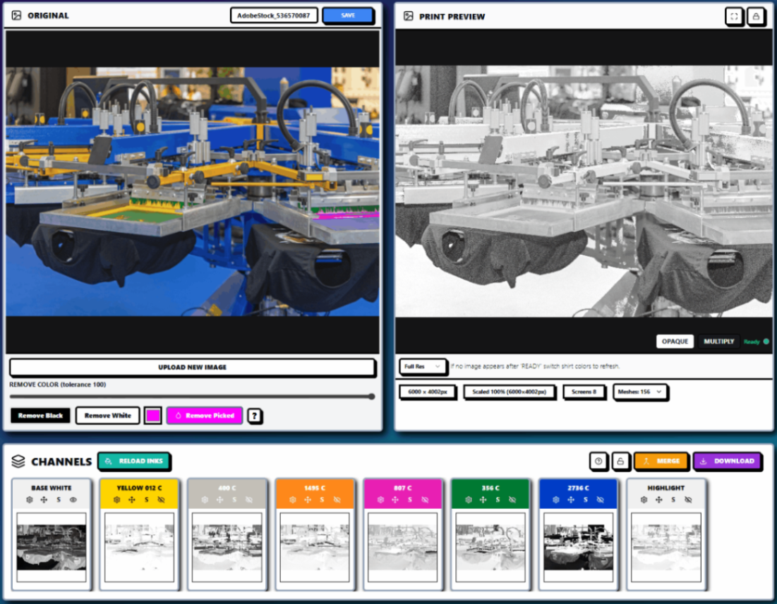
InkSplit’s automated color separation engine can:
Analyze artwork and generate spot-color or simulated process channels
Match colors to your shop’s saved ink library
Create intelligent white underbases and highlight channels
Provide live print previews on different garment colors
Display isolated channels before screens are burned
Process complex artwork using GPU acceleration
Output through a built-in RIP when you do not have a preferred RIP workflow
Store projects in the cloud for reorders and repeat production
Because it runs in the browser, InkSplit also eliminates installation and IT friction. There are no plug-in compatibility problems, desktop deployments, or separate application handoffs to manage. Your team can work from a calibrated, consistent workflow while keeping previous projects available for future orders.
A Practical Decision Guide for Your Next Job
Use this quick framework:
Choose spot color when:
The design has flat, distinct color areas.
The palette is limited.
Text and edge clarity are critical.
Brand or Pantone matching is a priority.
You need the lowest practical screen and setup count.
The run size or turnaround does not justify complex prepress.
Choose simulated process when:
The design includes photography.
Gradients and tonal shading are central to the image.
You need realistic color blending.
The garment is dark and requires a controlled white foundation.
Simplifying the design would sacrifice important detail.
You can support the additional screens and press calibration.
When the answer is unclear, run both strategies through a live preview and compare channel count, underbase coverage, tonal detail, and expected production time before committing to screens.

The Bottom Line
Spot color is the efficient choice for logos, text, flat artwork, limited palettes, and exact brand colors. Simulated process is the more capable strategy for photographs, gradients, and tonal artwork that needs a broader visual range.
Neither method is universally better. The winning workflow is the one that matches the artwork while protecting your shop’s margins and production consistency.
InkSplit gives you one production partner for both. With automated color separation, precision ink-library matching, smart underbase technology, live print preview, cloud-based project storage, GPU acceleration, and an integrated RIP, InkSplit helps your team make the right separation decision faster: and reproduce it consistently when the customer reorders.
Explore the InkSplit features, compare separation approaches in the InkSplit separation profiles guide, or try InkSplit’s online color separation workflow. For an independent overview of the differences between spot color and simulated process, ScreenPrinting.com’s comparison guide provides useful foundational context.
Comments